The four metrics
The dashboard shows four numbers. Get the definitions right and the dashboard reads itself. Visibility is the percentage of platform responses where your brand was mentioned at all. If 100 prompts ran across 7 platforms (700 responses) and your brand appeared in 280 of them, visibility is 40%. This is the mention rate. Mentions is the raw count behind visibility. 280 in the example above. Same data, different presentation. Share of voice is your mentions as a fraction of all brand mentions (you plus every competitor you’re tracking) for the same set of prompts. If you got 280 and your three competitors got 420 between them, your SOV is 40%. Visibility tells you how often you appear. Share of voice tells you how often you appear compared to who else is in the conversation. Average position is your rank in the answer when the AI lists multiple brands, averaged across every response that mentions you. Lower is better. 1.0 means you’re first every time. 1.4 means first most of the time and second the rest. Position answers ‘when the model mentions us, how prominently?’. Visibility answers ‘how often does it mention us at all?’. Visibility and position can disagree. You can be mentioned less often than a competitor but ranked higher when you are mentioned. The two numbers tell different things.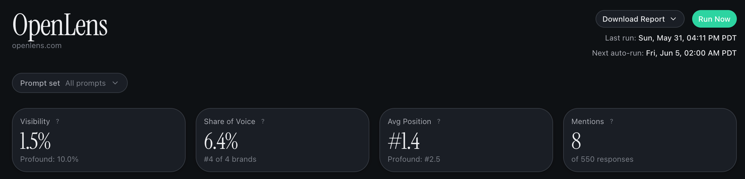
The four headline metrics on the dashboard: visibility, share of voice, average position, mentions.
Per-platform visibility
Same visibility number, broken out by AI platform. For each platform you also see your gap to the top competitor on that platform and a status indicator. Read it like a scorecard. ChatGPT can love you while Perplexity ignores you. The status indicator gives you a one-glance summary per platform, so you can spot the disagreements worth acting on.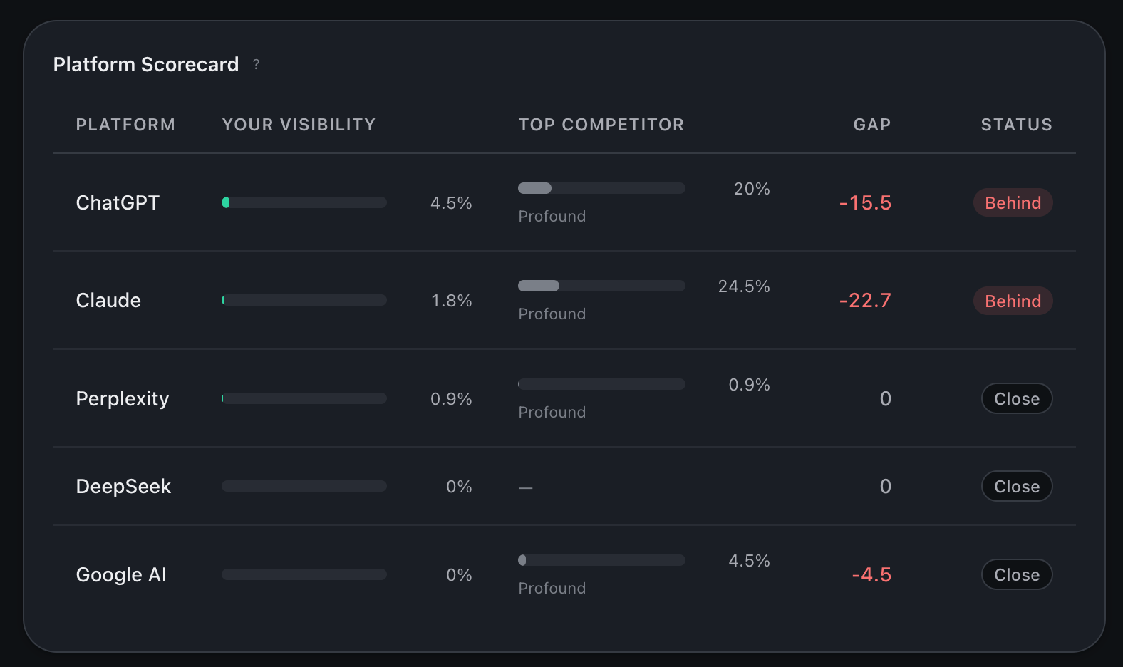
Per-platform visibility scorecard: your score on each platform, gap to top competitor, status chip.
Visibility trendline
Time series of your visibility number over a date range. Appears once you have at least two completed runs. Set up recurring runs in Settings (weekly or daily) and the line populates automatically. On-demand runs add a point every time you trigger one. Use this to spot real movement vs single-run noise. One run flipped against you isn’t a trend. Wait for three in a row before you act on it.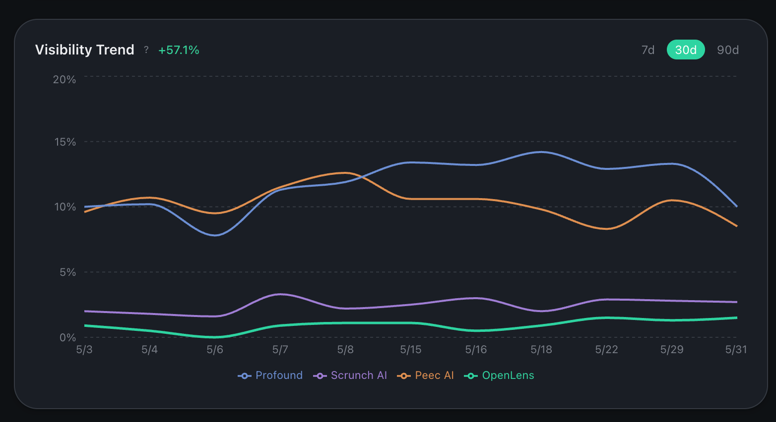
Visibility trendline. One marker per completed run.
Competitor snapshot
The headline view of how you stack against the brands you’re tracking. Three numbers per brand: visibility %, share of voice, and average position. Sorted by share of voice. Position and share of voice can diverge. A competitor can win on share of voice (mentioned more often than you) while you win on position (ranked higher when you are mentioned). Both numbers are real. They answer different questions: who shows up most, and who looks best when they do. A brand sitting at position 1.4 means models name it first most of the time even when other brands are in the same answer.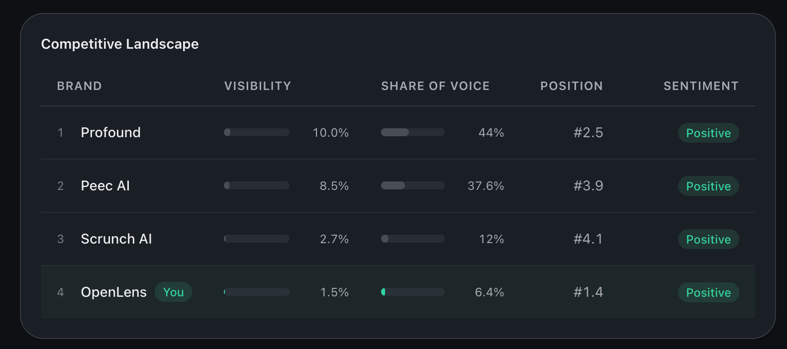
Competitor snapshot ranked by share of voice.
Topic performance
Visibility broken out by topic. Click into any topic for the per-prompt breakdown underneath. Use this view to find the topics where competitors dominate. Those are the gaps.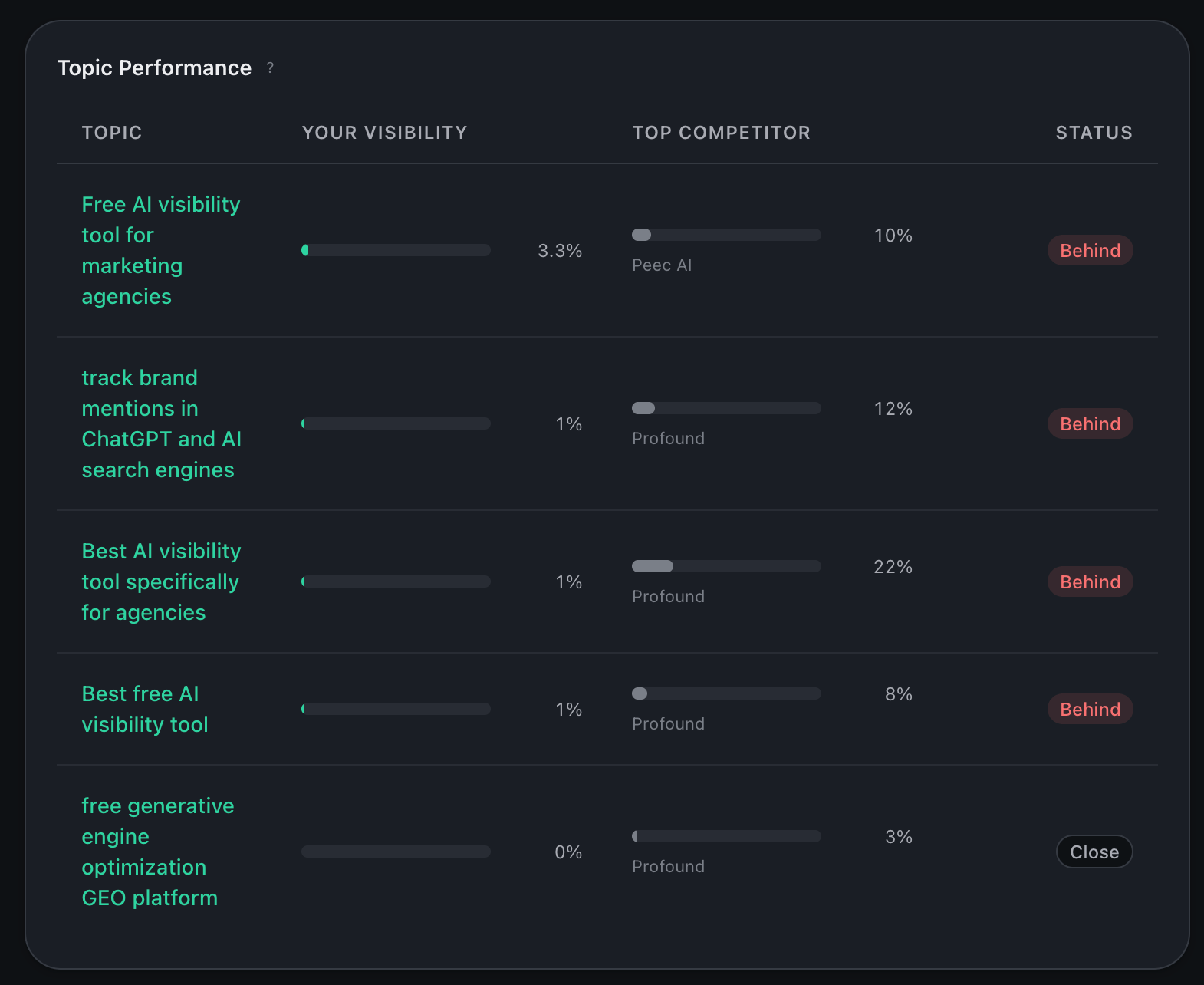
Topic-by-topic visibility. Click any row to drill into the per-topic deep-dive.
Source Mix
Where the models got their answers: every citation in the run, grouped into the kind of site it came from. The closest thing to a backlink graph for AI search. The donut splits the run’s citations into:- Your site and Competitors: your own domains and the competitors you track.
- Company sites: other businesses’ official sites, including their blogs and docs.
- Media & publishers: news, magazines, trade publications, independent blogs and guides.
- Reviews & listings: review platforms, directories, marketplaces and app stores.
- Community & social: forums, Q&A, social networks and video platforms.
- Reference & research: government, education, academic and medical sources, encyclopedias.
- Other: anything that doesn’t fit, or sites still being sorted after a new run.
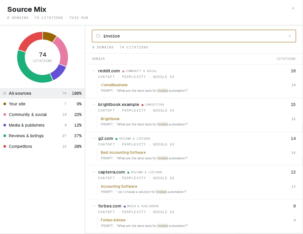
Source Mix explorer: the category breakdown as a filter, and a search that matches prompts as well as pages.
Slice by attribute
Every interesting dashboard cut is just an attribute filter. The most prominent example is branded vs unbranded prompts (prompts that name a brand vs prompts that describe a need without one). Filter the dashboard by attribute to see each slice in isolation. For the full mechanics, see Prompt attributes.What moves the visibility score (for real reasons)
- Your brand is being mentioned in more responses than before.
- Competitor mentions dropped.
- A specific topic moved up or down because models are surfacing different sources for it.
What moves the visibility score (for non-reasons)
- You edited prompts mid-run. Different questions get different answers.
- The active platform mix changed.
- Run-to-run variance. AI responses are stochastic. The system is stable in aggregate but any single prompt’s answer can flip.